Donno
When You Donno What to Watch
Product Design
End-to-End
Mobile App
5 min read
Sector
Business to customers
Design Role
Manager, Product, UX/UI, Research, Branding, Front-end
Donno is a hybrid app that helps simplify the movie recomendations due to the smart filters and additional features.
Problem
People are spending too much time looking for a movie to watch in the unorganized movies pool where the rating is unfairly distributed by the big distributing companies. Therefore the films other poor countries don’t have a chance to be discovered by the general public.
Solution
With unbiased search based on the users preferences on a genre, theme, country, or a year the users can discover the best film from any place - therefore seeing a new point of view, and satisfying their need with the genre. Complete database of films and AI will be helping user with the most precise search.
To keep users save their search or create the specific folders there was created a personalized home page along with discover folders - which is a express way to get curated recomendations.
Part 1 - Market Research
I downloaded the most popular film apps, and made my research based on the services and functionality they are offering. The idea was not to find the biggest database of films, but rather smartest and best organized filtering system with the alternative functionality to discover films, create folders, and try gamification functions
Letterboxed
IMDB
Cinefy
Raters
Filtering
Friendly interface
Sorting
Film Folders
Rating
Alternative movie search
Part 3 - Turning Research Results into a Concept
Combine all the services into one app
Let the users choose to store the data on their data base storage, or offer storage memory service
Facilitate online and offline research with simple user-friendly interface

Part 4 - Creating Persona
Social Work Researcher for NGO
Average Age:
30-40
Gender:
Female (can vary)
Occupation:
Full-time social worker with research responsibilities
Interest:
Passionate about social causes and community welfare.
Keen interest in understanding the impact of programs on the target audience.
Advocates for marginalized or vulnerable groups.
Frustration:
Limited time for research due to heavy caseloads and administrative tasks.
Struggles with manual and time-consuming data collection and analysis processes.
Challenges in reaching and engaging the target audience effectively.
Ambition:
Aims to contribute to evidence-based decision-making within the NGO.
Strives to improve the efficiency of research processes to allocate more time to direct social work.
Pain Points:
Limited resources for comprehensive research tools.
Difficulty reaching and engaging the diverse target audience.
Lack of automation leads to inefficiencies and delays in research projects.
Tools:
Leverages survey tools (e.g., SurveyMonkey) for audience selection and data collection.
Utilizes CRM or audience management tools for maintaining participant information.
Implements automation tools (e.g., MailChimp) to streamline communication and outreach.
Seeks user-friendly data analysis tools for quick insights (e.g., Excel, basic statistical software).
Technology Proficiency:
Comfortable with basic technology but may not have advanced technical skills.
Collaboration:
Collaborates with other social workers, researchers, and program managers within the NGO.
Part 5 - Userflow

Part 6 - Wireframes
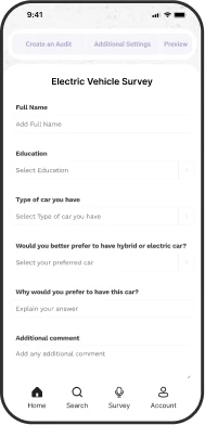
I focused on creating an audit at this stage and wanted to get external opinions early on. I asked some people to navigate the prototype without guidance and wanted to see:
If the navigation was intuitive
If there were features/information missing they would have found useful
How they felt during the process
Positive
Navigation was quite intuitive
Creating an Audit appeared to be
Improve
Some titles over the text inputs were unclear to the users
Square UI into more round one
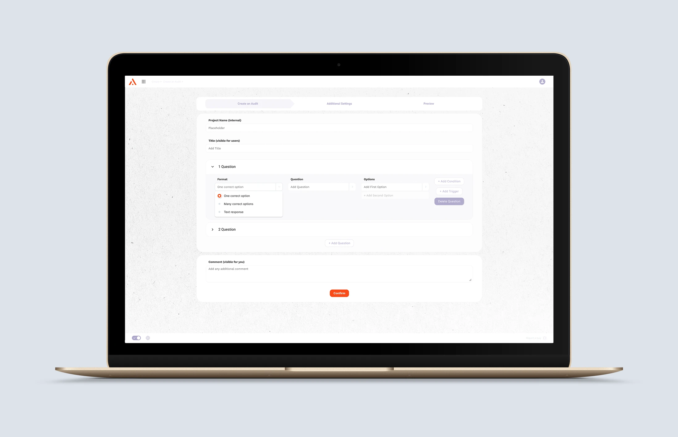
Part 7 - Improvements
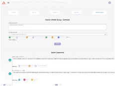
New Option Tag
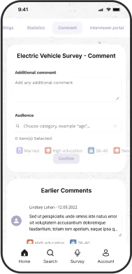
Once setting the tags for the Survey, already existing tags might be not enough, and the users will be able to add a new tag without opening another page. This tag will trigger a pop up window with all the tag settings.
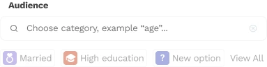
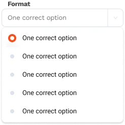
Radio Button Or Checkbox? Both!
Once responding the survey, I had to make it clear which question has multiple response option, and which are not. As

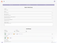
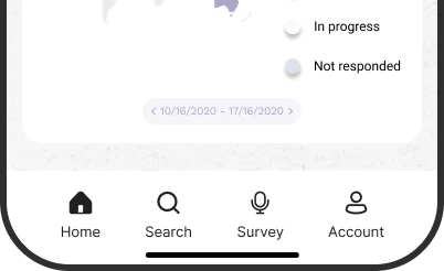
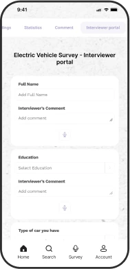
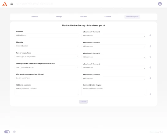
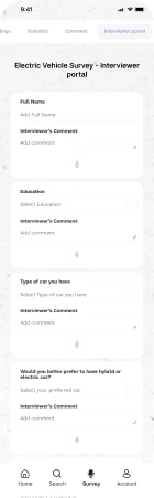
Survey Button for Mobile App
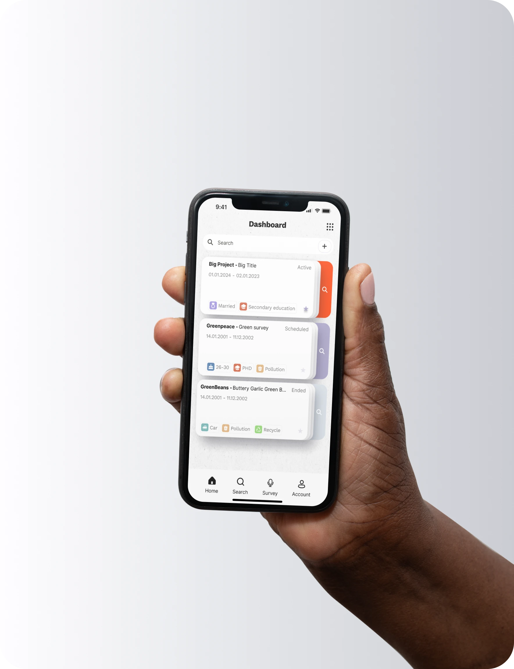
Having an option to be able to open the Interviewer Portal within a second is essential for the researchers, who are coming to conduct a survey in-person, therefore I decided to add a Survey option to the bottom menu.
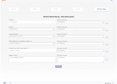
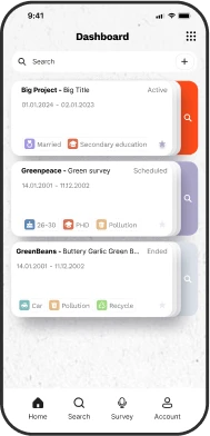
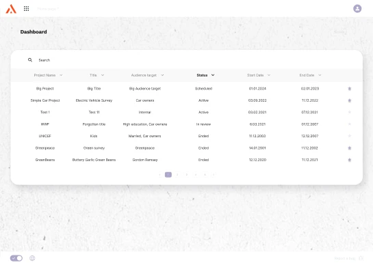
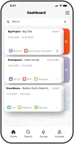
Home/Dashboard Page
It was quite tricky to show the table with all the surveys on a home page, but with the surveys being filtered by Active, Scheduled, and Ended it makes it easier to find the right survey.
Part 8 - Final User Testing
I took a final step back from my own design and asked 3 new testers to run through the hi-fidelity prototype.
1) I asked about the design and navigation.
2) I wanted to know if there was anything they found unclear or confusing.
Positive
Users found the color selection pretty and could easily navigate and create an Audit in Surv.

Part 9 - Final Design
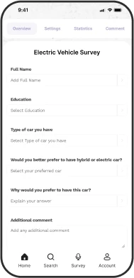
Home Screen
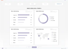
Survey Overview
Survey Overview
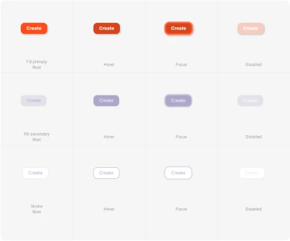
Design System
Design system is developed for maintaining the cohesive design across all the screens, and for developers to have an easy access to all the assets.
GRID
COLOR
TYPE
Work Sans
Bold / Medium / Regular
23pt
20pt
18pt
Inter
Bold / Medium / Regular
20pt
13pt
8pt
A FEW COMPONENTS
1

1
2
2
Format
One correct option
Format
One correct option
Format
One correct option
Format
One correct option
Many options
Many options
Many options
Many options
Many options
Format
One correct option
One correct option
One correct option
One correct option
One correct option
One correct option
Format
One correct option
One correct option
Multiple correct options
Text response
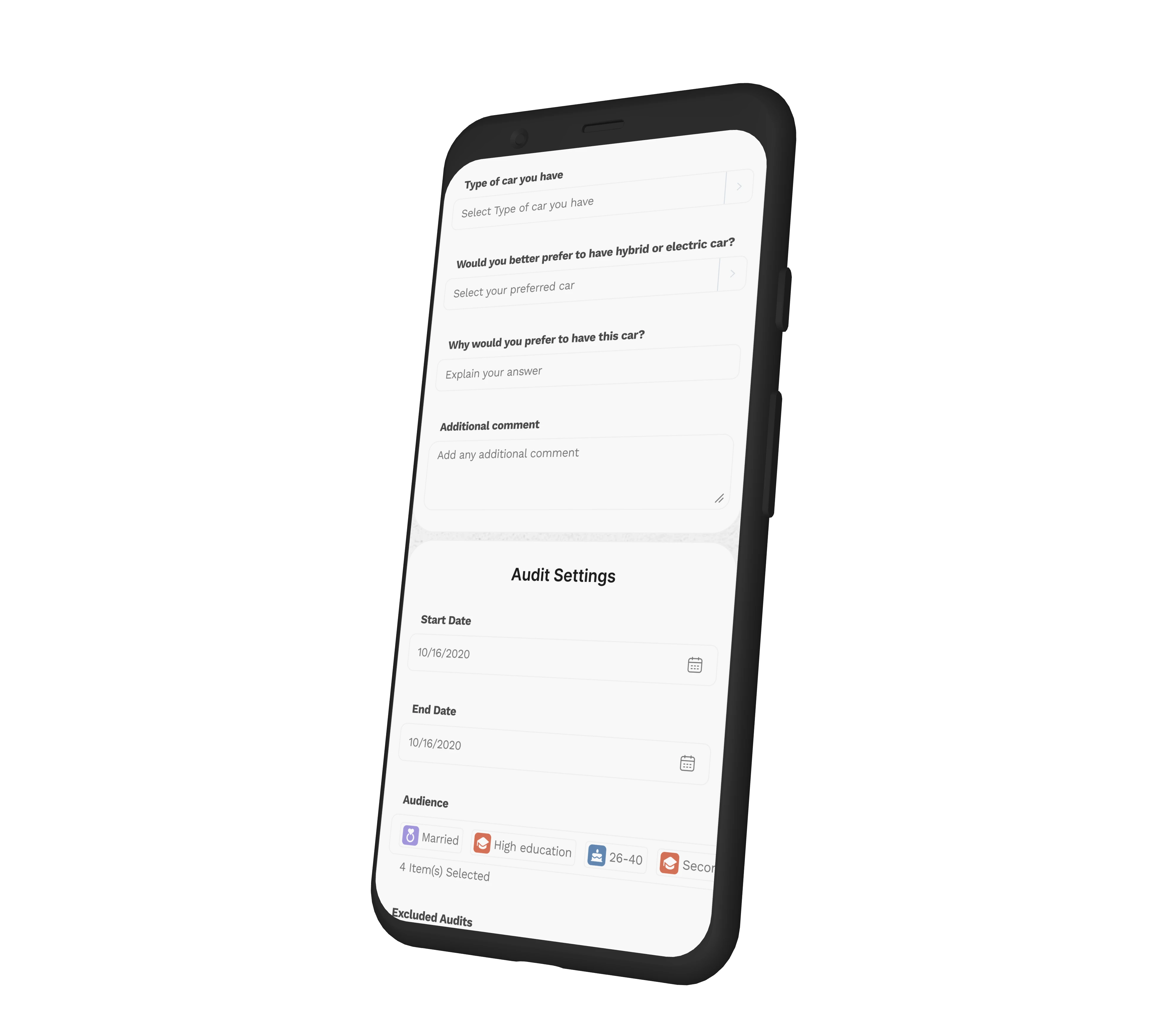
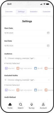
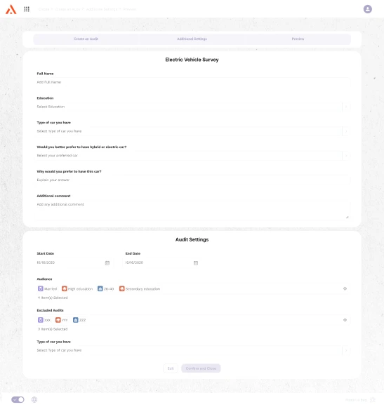
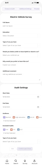
Create an Audit
Additional Settings
?
Moodboard, Inspiration
The color palette was inspired drom this dribble work
Part 12 - Conclusion
Through a thorough process of researching, testing, and refining my designs, I've reached a project I'm proud of. Yet, I recognize there's still plenty of room for improvement.
Key Lessons:
Seeking feedback from others was incredibly helpful. Their fresh perspectives helped me notice details I might have missed.
Choosing the right words can sometimes be trickier than making design choices.
I've learned that every design decision, from colors to shapes, shapes the identity of a brand.
What I Want to Improve:
I'd like to enhance my research approach. While I gained valuable insights from discussions with researchers, friends, and articles, I realize I could benefit from reaching out to a wider audience through interviews.
Areas to Work On:
I want to make sure every page's features are fully developed, including adding more automation functions.
I plan to test with a broader range of users to understand what engages them in other apps. I'll then create sample pathways to challenge the effectiveness of Surv's current method.